Inside the metrics playbook tech stack
How I built a cube with dbt, DuckDB and the Activity Schema
Last week we talked about the key insight behind the metrics playbook project. If you didn’t get that email or you missed it, you can read it here. This week I figured I’d do a deep dive inside the tech stack and show you the internals behind the project.
The metrics playbook is built on top of DuckDB and dbt.
The tech stack
DuckDB is a pretty recent, file-based OLAP database. It’s the equivalent of SQLite for analytics. It’s incredibly fast, works with a variety of file types like CSVs, Parquet, etc. and allows you to either query those files directly or build a database with them.
Dbt — on the other hand — is a tool that allows orchestration of SQL queries in a multi-stage DAG. That way we can build the cube in stages since many of the metrics are composites of the same base metrics.
Once completed, dbt docs allows you to visualize the entire workflow in a graph-like UI. You can see the one I built below.
As you can see it looks pretty complex. There are lots of interconnected nodes, but that doesn’t mean it’s not easy to understand. The data flows from left to right. For orientation, anything to the left of a node is considered “upstream” and everything to the right of a node “downstream” like a river flowing left to right.
The contract_stream and dim_customer nodes form the base layer. Everything is derived from there. The next layer comprises the base metrics for SaaS growth accounting. Each node represents a table with the calculation for that metric and all the time and dimensional grains.
Some nodes downstream (like gross_revenue_churn) can refer to nodes upstream from multiple layers. This is ok for our case since the number of metrics is limited, but in larger dbt deployments, this graph can get very unwieldy.
The cube schema
Now that you’ve seen an overview of the tech behind the MPB, it’s time to look inside and see how the tables are structured.
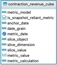
Other than the base nodes, every other node has the same schema. This is very important because the final node is a union of all the cubes in a single table.
Before we get there we need to talk about the contract_stream node. This table is modeled after the Activity Schema. It consists of all the potential SaaS contract activities, the customer_id that performed them (the company for B2B SaaS) the timestamp when the activity occurred, the revenue_impact associated with that activity and some attributes related to that activity, in our case the plan_type.
Here’s what the data looks like in this table. Notice the 2 utility columns for activity_occurrence and activity_repeated_at. You can read more about them in this github repo for the spec. We’re using a variation of the schema here since they recommend a JSON payload for it. I might change it to a JSON field later on.
With that out of the way, let’s talk about the cube schema. The idea for the schema is to take a traditional OLAP cube and flatten it out into tables. This means we calculate all the possible metrics that we want (sums, averages, counts, ratios, etc.) for all the metric slice combinations (like plan type, channel, segment, cohort, etc.) and store them in each table.
This is what the schema looks like for one of the metric cubes.
To understand what the columns mean, have a look at some sample data.
So the metric_model stores the name of the metric. The anchor_date shows the date used to calculate the metric (all metrics are basically time series) In this case the anchor_date is the timestamp from the contract_activity table.
The slice_object is a JSON object that stores a description of the dimension key/value pair. You can see that more clearly on the segment slice. Then the metric_value stores the actual value of the calculation and metric_calculation shows a description of it.
Though not shown here, the final table is a union of all the individual cubes stored in a giant cube table and served via a BI tool like Looker, Tableau, Superset, etc.
SQL magic on the cube
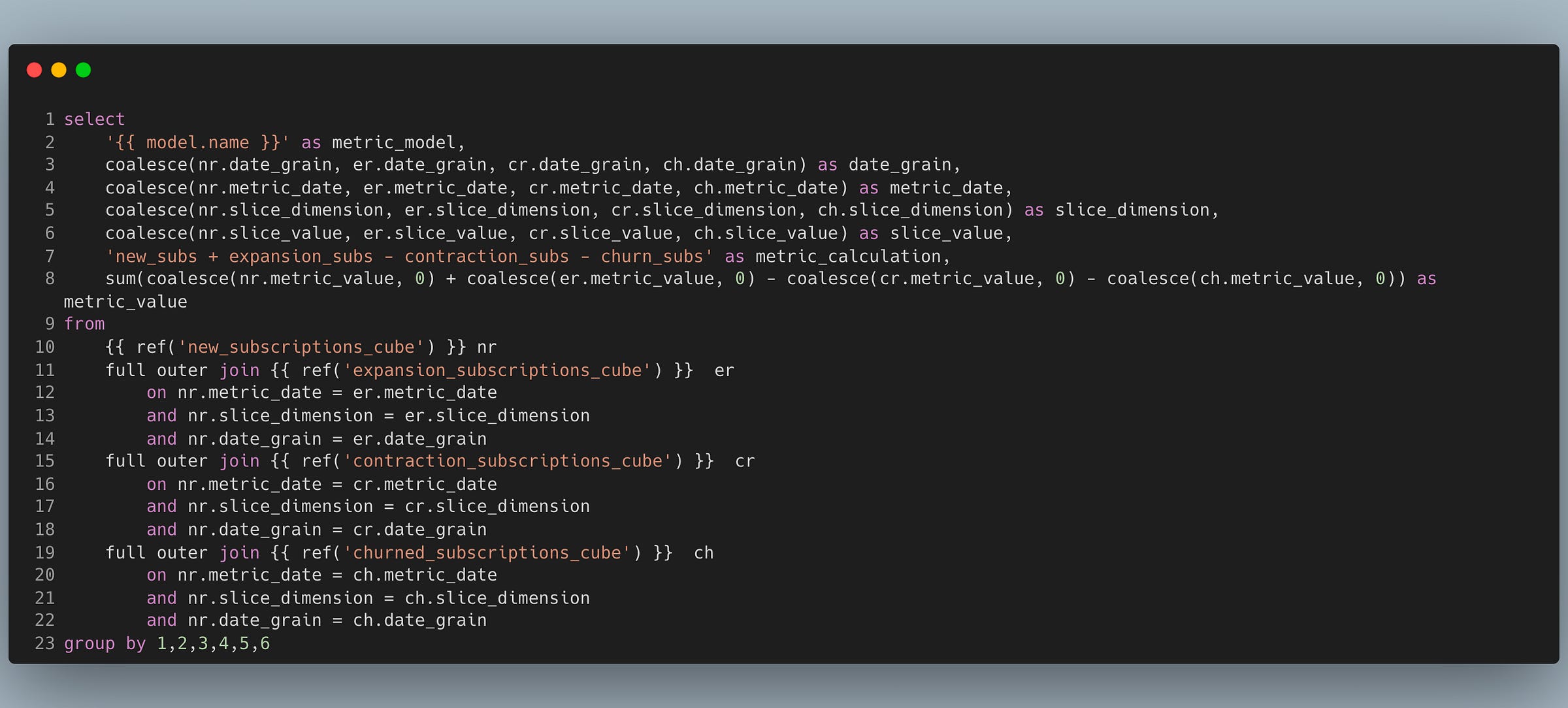
What makes this model extremely useful is the ability to define composite metrics by joining on the same columns. For example the net_recurring_revenue metric formula is new_rr + expansion_rr - contraction_rr - churn_rr and the SQL code for it is:
Notice how simple the joins become. Every metric is joined on the date, date grain and dimension. I’m using full outer joins here because the data might not be available for some of the metrics, so we want to make sure we still have a metric calculation for the net_recurring_revenue.
In future issues we’ll do a deep dive on the business side of metrics, how they’re used and how they enable operational excellence.
All the code for the project is open source and available on Github here.
Until next time.


Amazing article !! I was looking for single table models for metrics, and this seems to be the easiest to build.
I am curious how would you handle cases where you want multiple dimensions in the cube ? Say segment and product category ?
..."For orientation, anything to the left of a node is considered “downstream” and everything to the right of a node “upstream” like a river flowing left to right."...
I think it's the opposite.
Great article, btw.